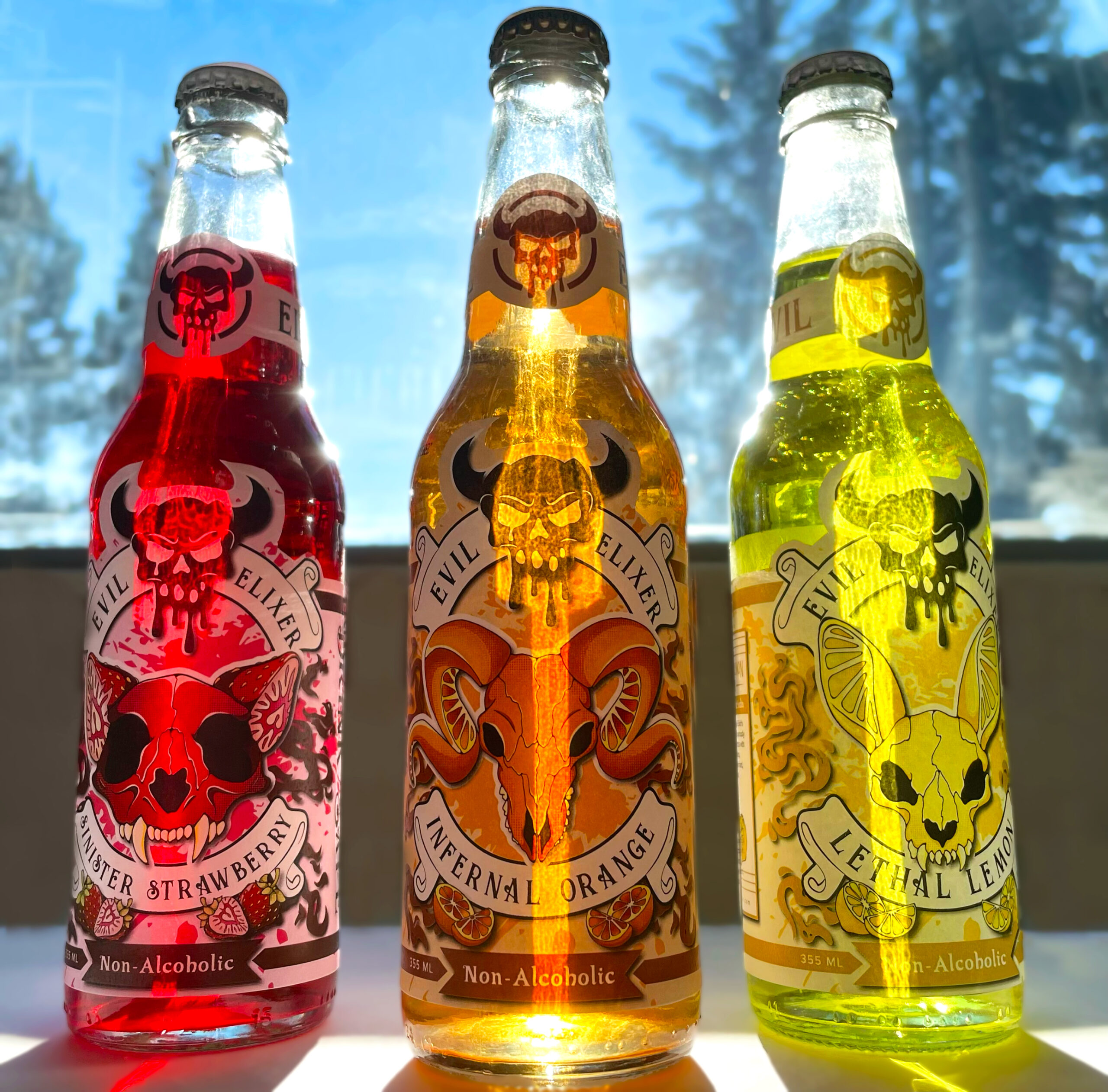
Evil Elixir Product Design
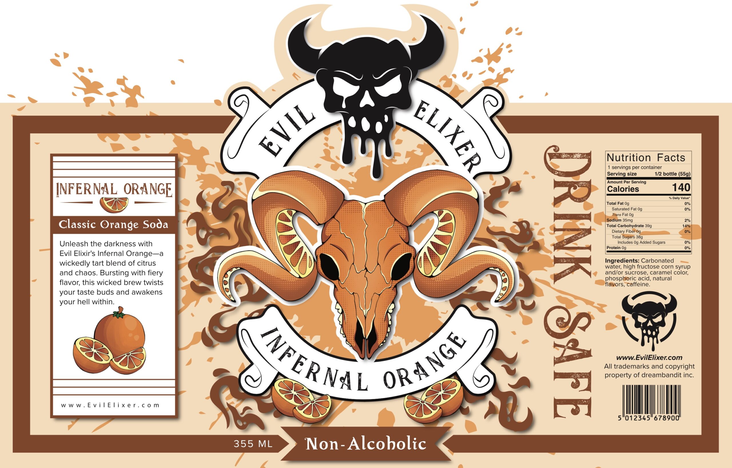
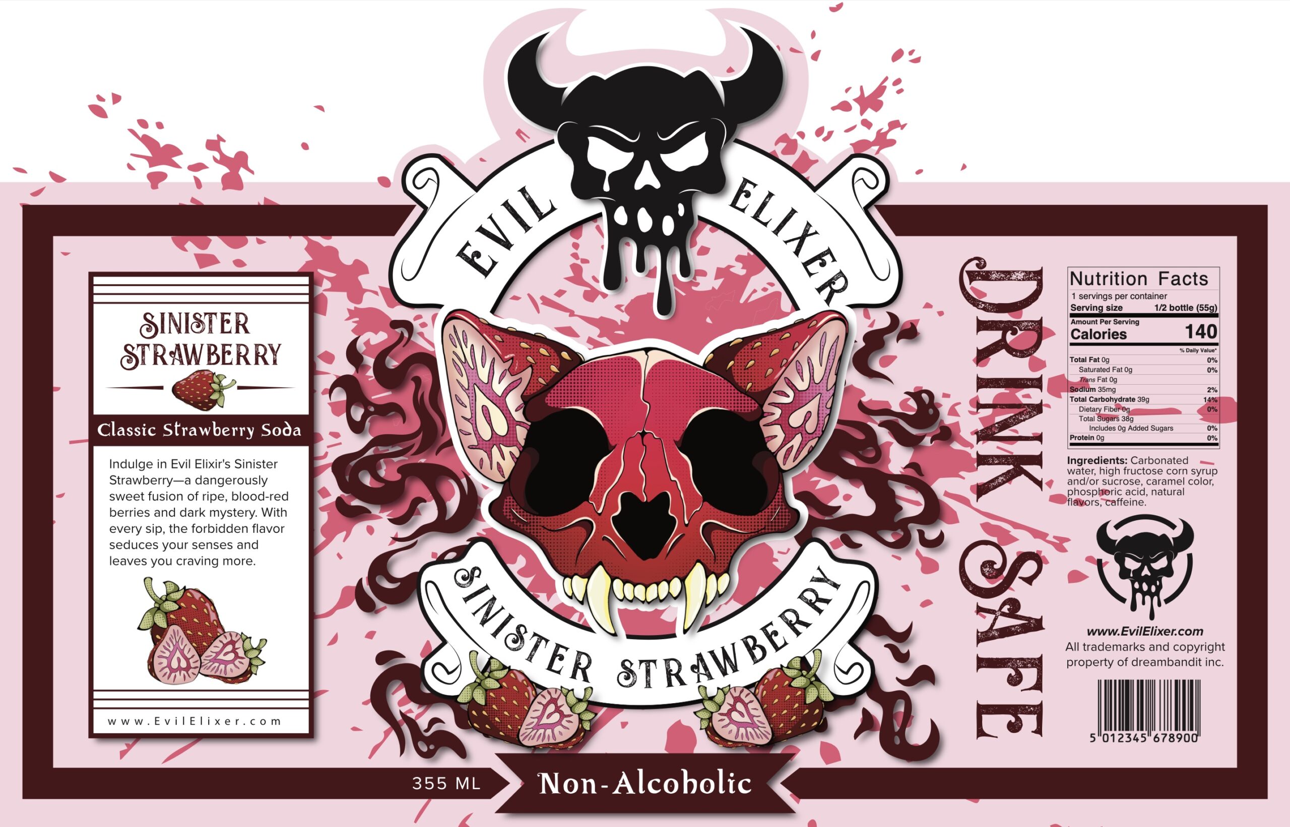
This project was a study on brand and package design, experimenting how to create both a strong product concept as well as the package design needed to sell it. To accomplish this I came up with a non alcoholic soda brand called Evil Elixir. The goal of this product was to serve as a replacement for alcoholic drinks in a social setting, whether it be for designated drivers or just personal preference.
The alternatives to alcoholic drinks often times feel limited, either overpriced mocktails or overly recognizable sodas that carry a juvenile or “uncool” perception. Therefore, my goal was to design a beverage that could exist comfortably alongside alcoholic drinks with more mature graphics and brand design. At its core, the challenge was to create a product that relied on its package design to overcome stigma and lack of appealing choices for people who want something different.
Step 1:
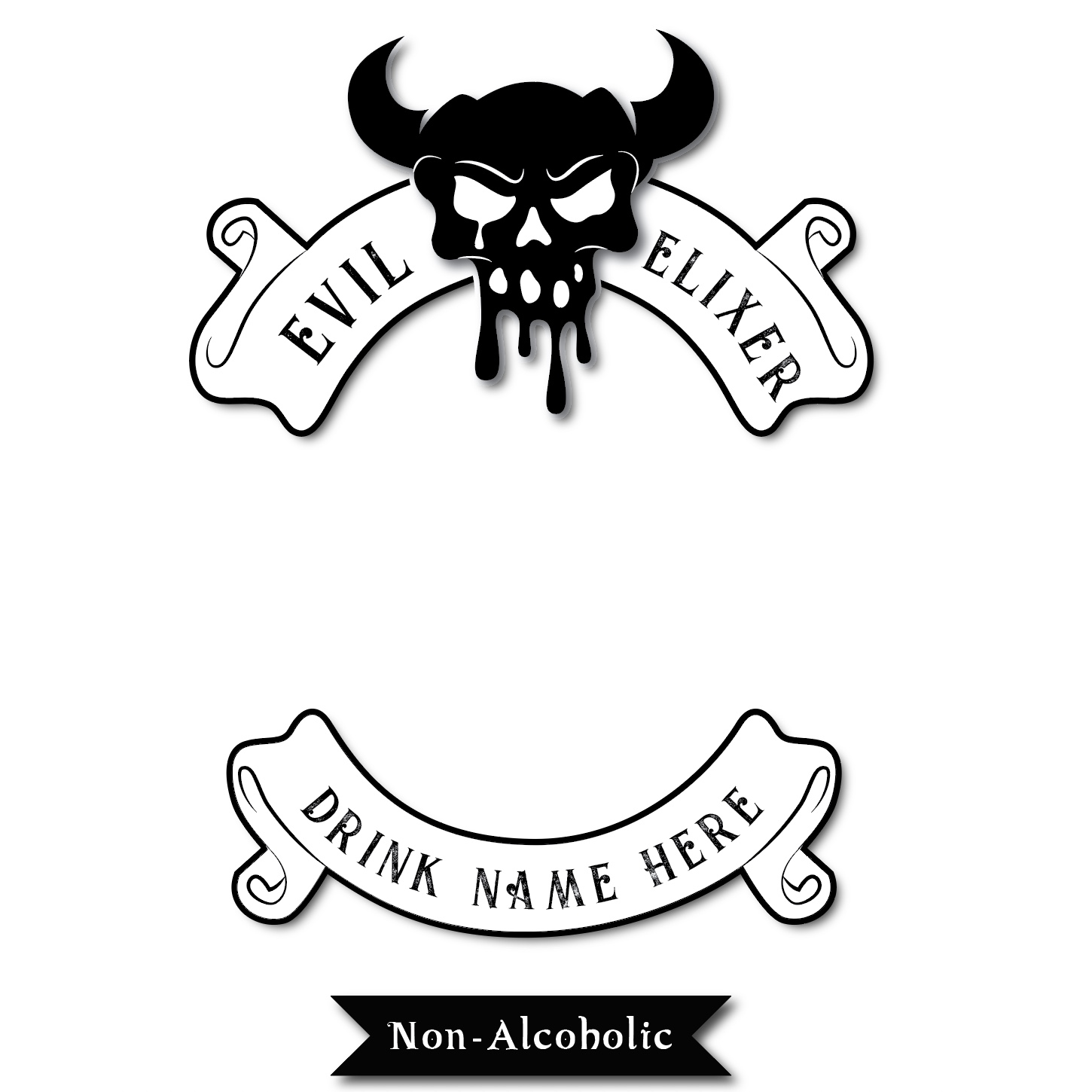
Brand Design
Creating a brand that will be producing this product is the first step, unifying all future illustrations.
Step 2:
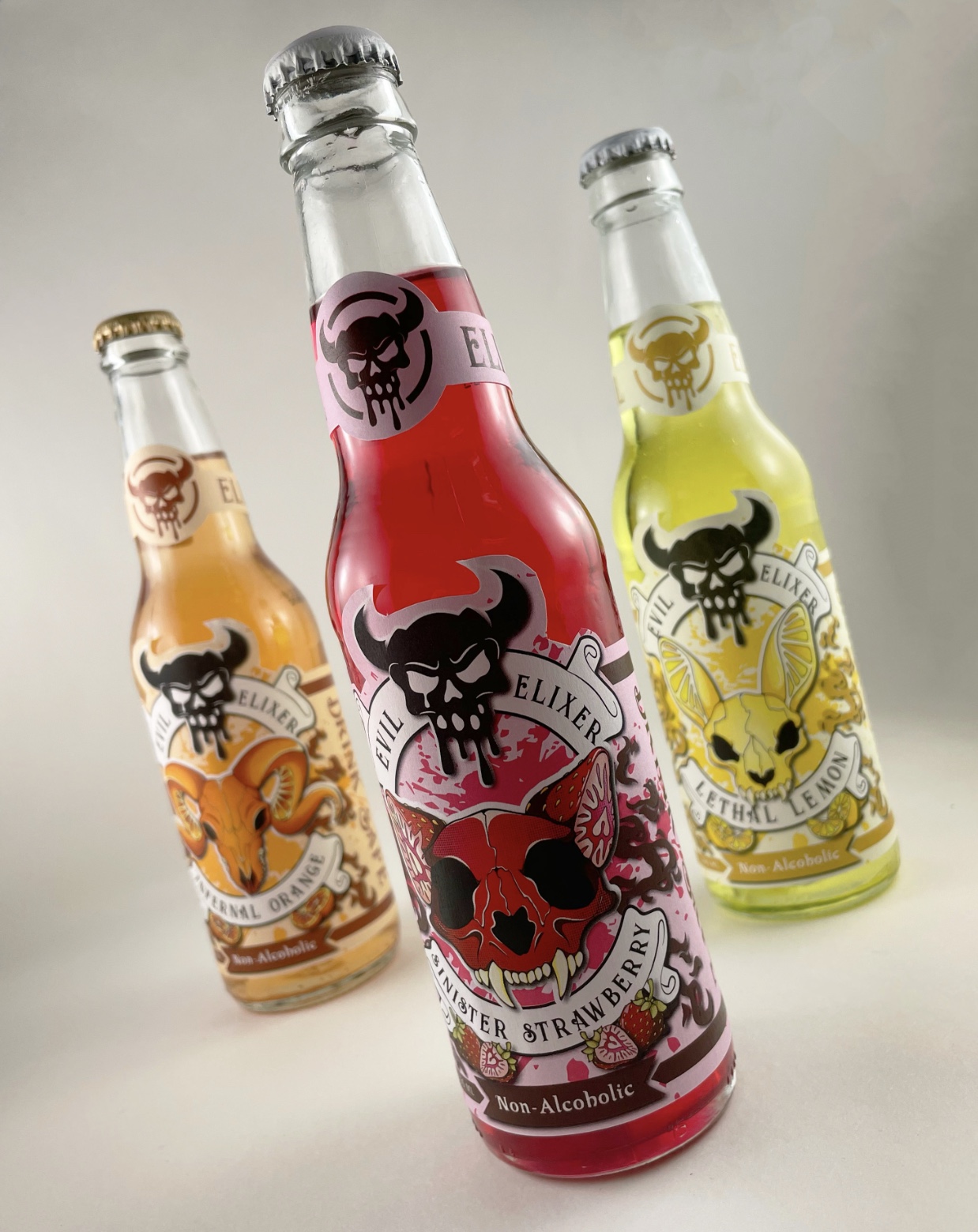
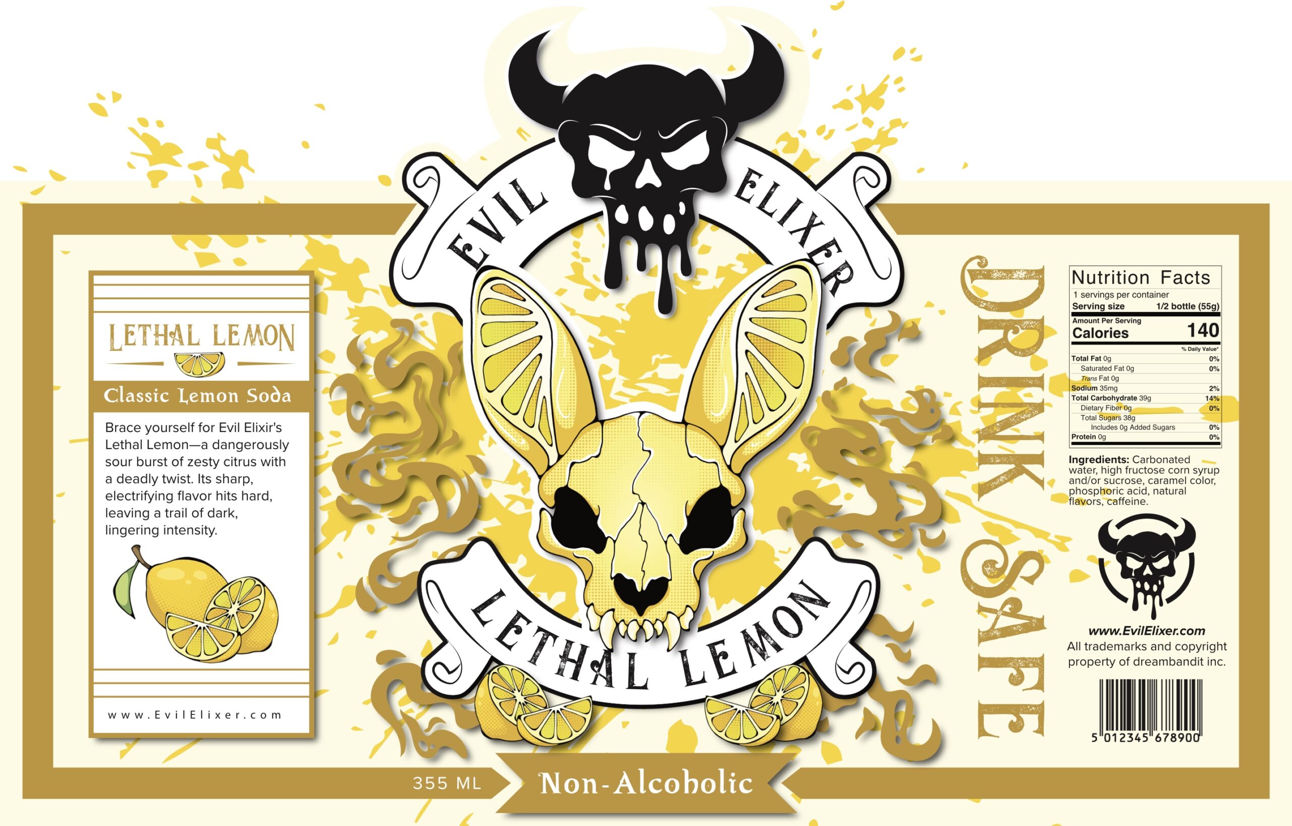
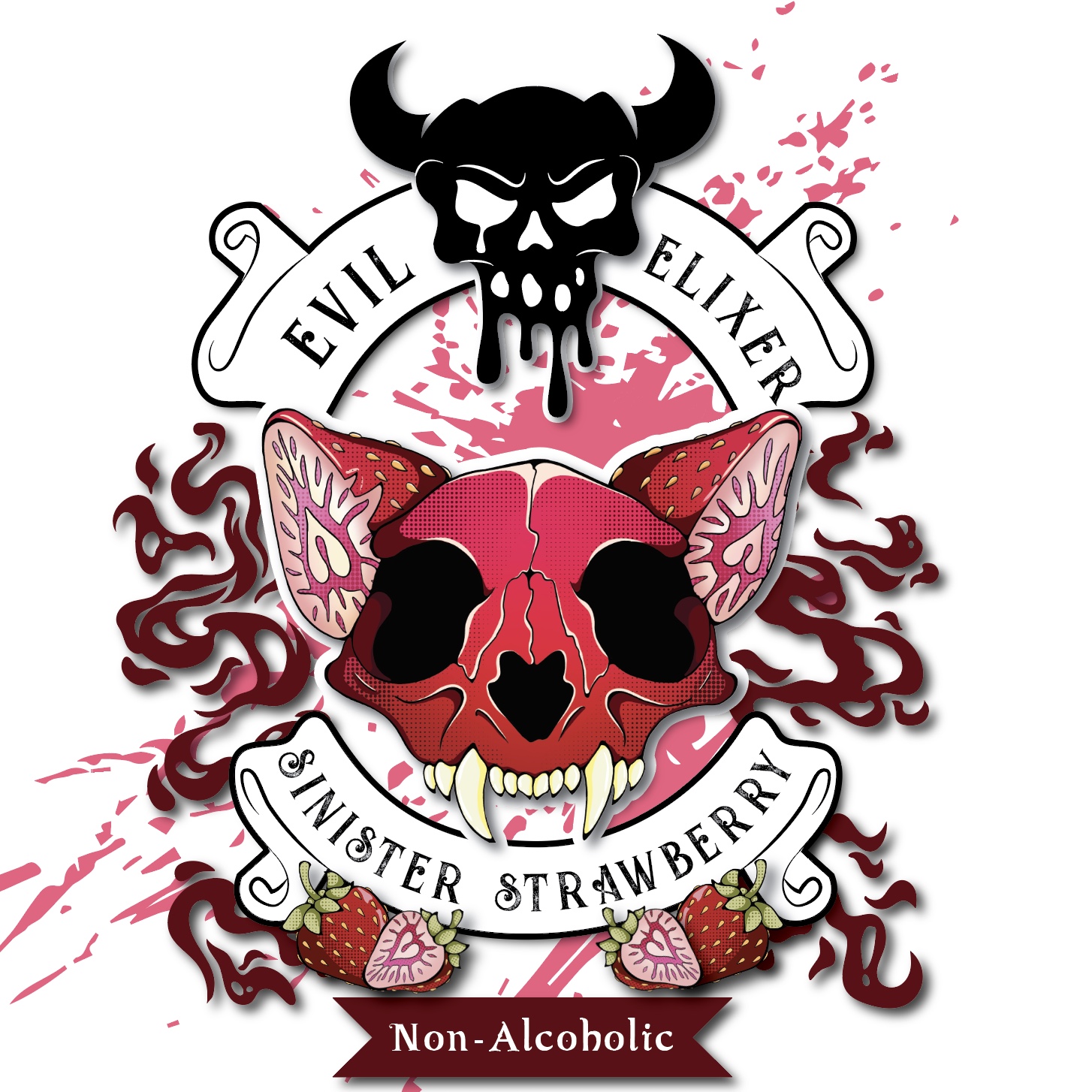
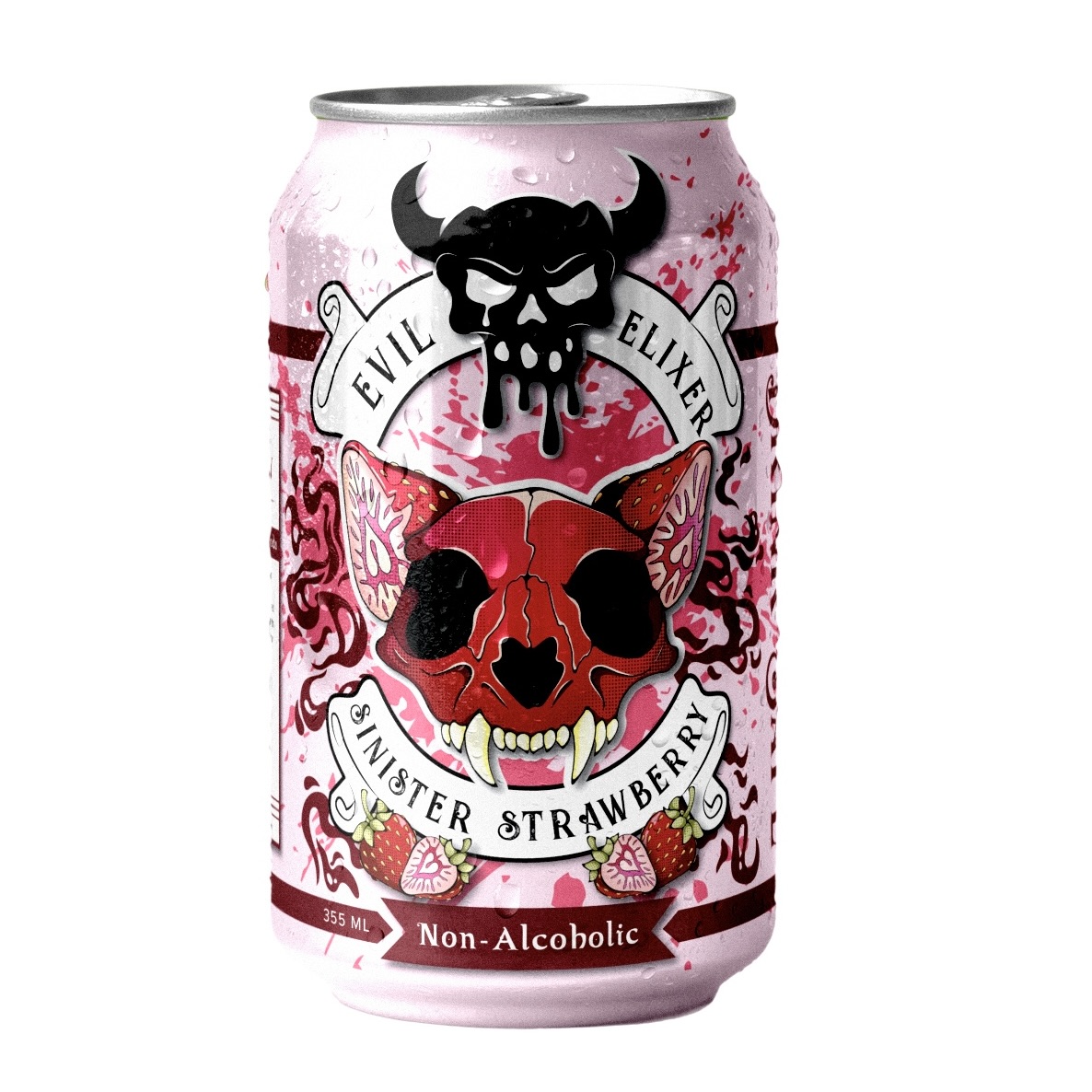
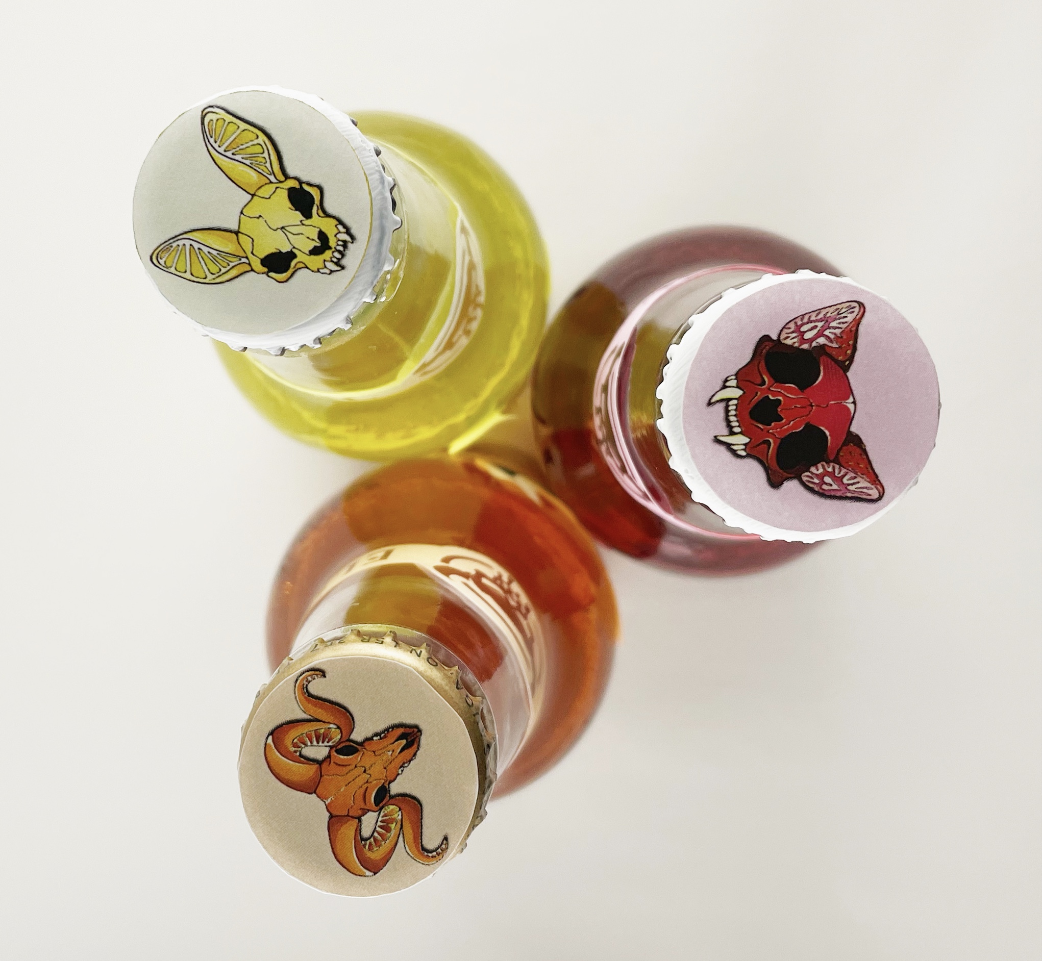
Illustration
Creating bold illustrations gives life to the brand created previously, also working to sell the product.
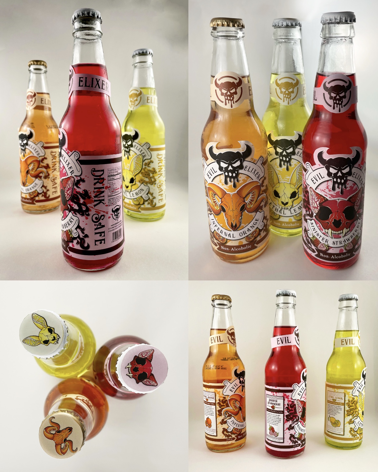
Step 3:
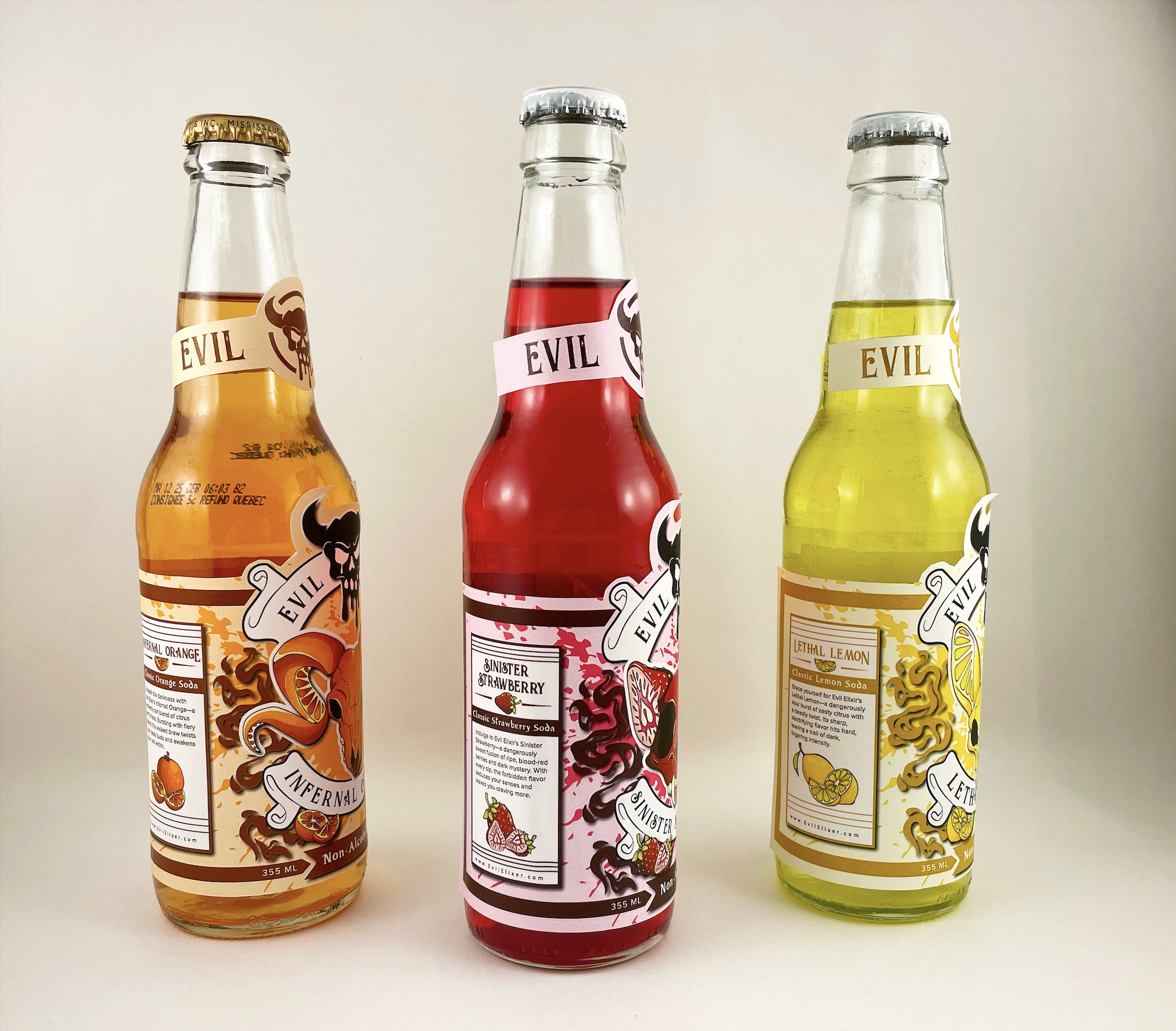
Prototype
Displaying the product in a clean and recognizable way shows audiences what they’re in for right away.
The Inspiration
My approach focused on reframing non-alcoholic beverages as a deliberate choice rather than a compromise. I began by considering the wide range of reasons people might choose not to drink and aimed to create a design that could resonate with them all. At the same time, I recognized that social settings like parties are inherently energetic and expressive, so the design needed to reflect that sense of excitement rather than feel restrained or overly serious. To do this, I leaned into a tone that embraces irony and bold personality, appealing to audiences who value humour and self-awareness in branding.
The Approach
To bring this project to life, I began by developing a foundational brand identity including a name, fonts, brand colours and a logo. Establishing this brand identity informed the visual direction of the packaging and ensured cohesion across different flavours. From there, I used bold illustrations and stylized graphics to create a visually striking and memorable package design. My skills in graphic design and illustration were central to the execution, but equally important was my ability to craft a compelling brand narrative through naming and visual language alone. The final result is a product that blends maturity with playful irony, offering a unique alternative to alcoholic drinks that will blend right in with the rest of the social setting.
Programs Used

Adobe Photoshop

Adobe Illustrator